Although most people will look at website design as purely visual, it is much more than that. Research has shown, time and again, that aesthetic choices impact not only branding and consumer impressions but web visitor behavior as well.
With this in mind, it becomes clear that aesthetics matter. What is more, we know that design choices and website color schemes will have an overt influence on a website’s success.
If you’re developing an online presence for your brand or doing a redesign, it might not be a bad idea to pay a bit more attention to the choice of hues you use on your site. The following are some of the top tips for choosing the right color scheme for your website.
Do Colors Have Meaning?
The first step in picking the right color scheme for your site will definitely come in the form of determining the right hues for your brand.
When approaching this task, you must have a clear vision of what you want your business to stand for. What is your industry, your mission, your values? How are you different from your competition, and what impression do you want to leave on your clients? Are you approachable and user-oriented, or do you want to exude a sense of luxury?
Throughout history, brands have used a variety of colors for their logos and visual assets, usually based on color psychology. In fact, the effect that color has on how humans feel has long been studied, going back to Goethe and his book Theory of Colors published in 1810. In this book, the writer described the psychological effect and meaning of colors. Most of these effects are still widely accepted today. But while the book is a printed work, it is far from a scientific document. And color theory, as such, relies more on the assignation of meaning than on scientific evidence.
This means that, when choosing the color scheme for your logo or website, you might want to stay away from the standard cliches that seem to be ruling today’s color trends.
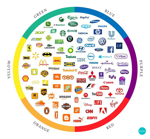
Source: Canva.com
Instead, it’s not a bad idea to start from your brand’s core identity and try to create a visual representation of it. Once you’ve got the basics down, you can go on to choose the most appropriate color combinations and determine which hue you will use for which purpose.
You can go in a minimalistic direction and use color only to draw attention to valuable elements. Or, you can attempt to create a cohesive impression that web visitors will experience by interacting with your site.
Connect Colors with Intent
When choosing a color scheme for your website, you will want to make sure that every hue found on your website is connected to some form of meaning.
For example, you can use colors to categorize different elements. Look at the Sleep Junkie homepage. You will notice that each of their articles is placed within a broad category. As each of these resource groups covers a different topic area, they’re assigned different colors: green for buying guides, purple for scientific data, and blue for personalized tips.

Source: SleepJunkie.com
On Transcend’s website, however, the design team chose to go a very similar direction, all the while achieving a completely different visual effect. On their homepage, which is monochromatic gray, only a single shade of red is used. Assigned to the highest-value elements on the website: the company logo, the copyright banner, and collection pages in the navigation menu, it’s used exclusively for highlight.

Source: transcend-info.com
Or, you can even go with a combination of the two methods. Amazon repricing software Aura has a well-designed homepage in which a minimalistic basis combines with contrasting color choices to call attention to high-value elements. So, all CTA buttons use a shade of green, while software benefits are represented in blue. It’s a simple design strategy, yet it’s one that works. It directs the website visitor’s attention precisely where it needs to be.

Source: goaura.com
Use the Available Tools
Color psychology doesn’t need to influence your choice of color scheme for your website. However, it’s still crucial that you don’t make the wrong decision.
When it comes to combining two or more hues, it’s surprisingly easy to make a mistake. Yes, everyone knows that red and green do not mix, especially for text. But what about the more subtle nuances of good design?
The one thing you can do to ensure you’re making the best possible choice of color scheme for your website is to always refer to a color wheel. You can use a variety of tools that are found online. Nonetheless, one of the best ones comes from Adobe.
By consulting a color wheel, you can pick analogous, complementary, or shades of monochromatic hues that will be in harmony and won’t clash. Still, they will provide the necessary contrast to allow you to emphasize high-value elements.
Furthermore, don’t forget that color schemes alone don’t make for a well-designed website. For a complete aesthetic experience, you will also need to pay attention to negative space, layout, typography, and images. All of these make for a cohesive visual impression that will result in a pleasing user experience and, consequently, a satisfying number of conversions.
Final Words

Source: depositphotos.com
As you can see, color schemes can be difficult to get right. That’s why the key element in choosing the best one is going to be time. Whether you’re designing your website on your own, or have hired a professional service, give yourself sufficient time to think your choices through. In the end, the perfect website color schemes don’t have to adhere to your industry’s rules. However, it does have to be complementary to your branding and part of a positive UX, contributing to the overall success of your business.
Interested in custom web design and revamping your site? Give Beanstalk a call! Let’s grow your business together.