Minimalist design isn’t new. Most historians date the style back to the late 1950s and artists such as Frank Stella. As with most artistic bents, it has re-emerged with a modern flair in recent graphic design trends. The simple lines and lack of clutter make the technique particularly useful to those wishing to put the focus on a certain element on a landing page or reduce confusion about which step users should take next.
Mobile browsing increases a bit more each year, with many people now using their smartphones exclusively for this. The growth of smaller screens means sites should be responsive to these devices. Cutting the clutter reduces the number of elements that must adjust to different browsers. It also ensures the page isn’t so smushed together that it’s unreadable.
Whether you love the look of minimalist design or wish it would go away, there are some clear advantages to using a simpler style. One of the best ways to perfect this technique is by studying the successful creations of others.
1. Create a Singular Focus
The objective of minimalist design is to create an on-point focus for the user. There is no confusion over where to go or what to do on a landing page. Designers cut all the elements not needed and keep only what is of absolute necessity.

You won’t find a lot of information on the Koox website outside of what you need to place an order. Even though there is some slight animation to the illustrations, they are kept simple and to the point. The navigation is limited to Home, Food, About, and Order. Everything on the page guides the user to place an order without additional bells and whistles to distract.
2. Load Pages at Lightning Speed
Less information means your pages load quicker, and you’ll cut down on the amount of code needed. Simplistic designs also get rid of any unnecessary scripts, which can bog down your speed. Everything is limited, from the number of images used to the forms needed. The simpler the design, the faster it pulls up.
At the same time, ensure you use compressed images, so they load even faster. Consider placing photos within a content distribution network (CDN) for load times rivaling the biggest websites on the planet, such as Amazon.
3. Balance Positive and Negative Space
One of the most basic components of good design is a balance between positive and negative space. Minimalistic design means you have plenty of negative space where the user can rest their eyes. White space also draws attention to the most important elements on the page. An excellent balance creates a calming effect and reassures site visitors you are a professional.
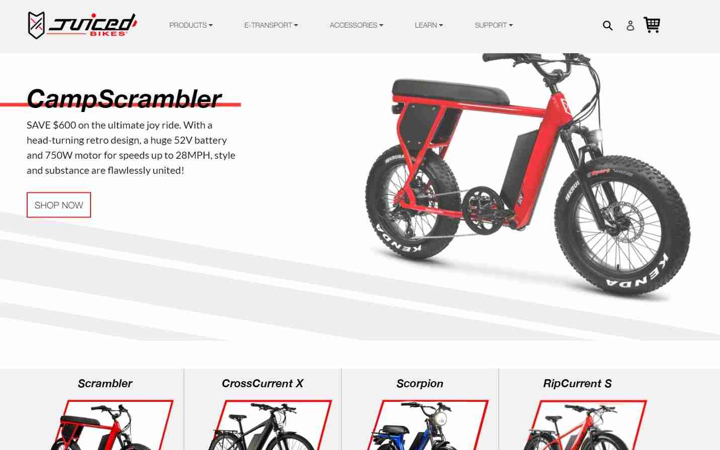
Juiced Bikes balances the white space on its page. Note the expansive white background with subtle gray lines to indicate motion. The simplicity highlights the product showcased on each slide. The color palette is also simple, so there are no distractions. The text is black, there are red accents, and everything else on the page is white and light gray.
4. Improve Scannability
People tend to skim over material. Sometimes they access your website while on the go, while at others, they’re just in a hurry. Whatever the reason, cutting the amount of information on your website allows them to read through it quickly and gather the main points. A simpler design lends itself to a more readable format.
5. Simplify Navigation
If you add too many categories, your navigation becomes clunky and difficult to maneuver. A minimalist design lends itself to fewer main labels. You can always extend the offerings through a mega menu and subcategories. However, keeping the choices limited guides your users where you most want them to go. 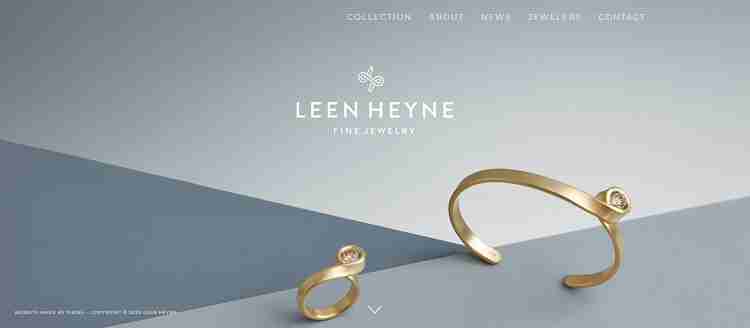
Leen Heyne keeps everything simple right down to the monochrome color of its design. The background features different shades of gray, and the logo is a muted white, as is the navigation. Five categories take up a mere portion of the top of the page. Everything is simple, and there is plenty of white space. Focus is on the navigation and where you should go next on the site.
6. Make Content Pop
When you use limited colors and elements on a webpage, you draw attention to the few things there. You can make a product image pop or draw attention to a video or article. What is on the page becomes vitally important. Use a monochrome design with a pop of color for the one thing you want users to notice first.
A Trend Never Going Out of Style
Minimalism is less of a fad and more of a viewpoint. Keeping things simple and honing in on one vital thing at a time never gets old. You’ll likely see minimalist designs for many years to come. Adding even a few elements of this style to your website ensures it has a timeless quality your users will love.