Converting a website visitor is an uphill battle at the best of times. And as the digital world evolves, we need to take into consideration the way we want our landing pages to accomplish these tasks.
In this post, we’re going to cover an aspect of landing pages that can turn the tide in your favor: visuals. Let’s take a look at some best practices that can help take you to the top.
Choose the Right Colors
One of the first things to consider when it comes to your landing page visuals is their color.
Colors can heavily influence how we feel about something. Hence, you’ll want to utilize the colors on your landing page to evoke specific emotions, and ultimately, to inspire conversions. If you are looking to evoke excitement and a sense of adventure, you’ll want to go for more vibrant colors. If you want your page to inspire calm and serenity, more muted tones will work better.
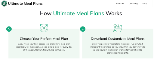
Let’s illustrate that point with an example. Ultimate Meal Plans bases their visuals around the color green, which is in line with their brand and product: healthy meal plans. This is the kind of smart choice we have in mind – although they are not an eco brand, green still helps their visitors think of healthy veggies and a healthier diet.
Illustrate More Challenging Points
If your landing page features facts and figures that take a lot of explaining, you might want to help your visitors out a bit and offer some visual aids that can make them easier to grasp.
This is especially true if the actual figures are an important sales point. If they are there to serve as a mere addition to your point, you might want a different visual to complement them, and go for something that is more in line with your sales pitch. But if the numbers are important – make them visual!
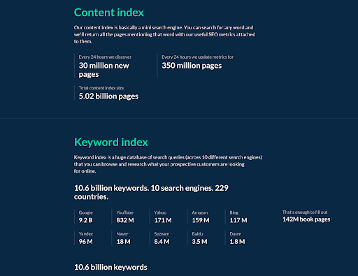
Ahrefs’s data page does this exceptionally well. We could argue that the dark background is a bit disruptive, but the way they tackle the facts and figures is spot on. Charts and tables both usually work well, but make sure you don’t just add a simple chart – make it as personal to your brand as possible.
Flash the Elements You Want to Pop
Flash being the opportune word here.
If you are advertising a sale or a discount, you want that element to pop as much as possible without taking over the entire screen. Tasteful and not garish, but still being the first thing a visitor sees when they land on your page.
Most brands will choose to use the color red for the purpose –and with good reason, as it works best in most cases (unless your entire website is also red-toned).
Each Night advertises their mattress sales page with the clever use of similar images throughout – and they do pop rather well.
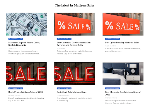
They instantly tell you what the page is about, and you won’t even have to read the title to get the gist of it, as all the sales and discounts are listed here.
Show the Product
We won’t even go into a discussion about showing the product on product pages. That should be a given, and certainly a tactic you have been employing since you created an online presence.
However, if you don’t have a physical product, but a digital one instead, you should still aim to show it in action on your landing pages. The otherwise confusing world of SaaS can easily be enhanced with the aid of some clever screenshots. Use them to show the product, illustrate important points, or even just as teasers of the software in action.
Instapage does this with great success.
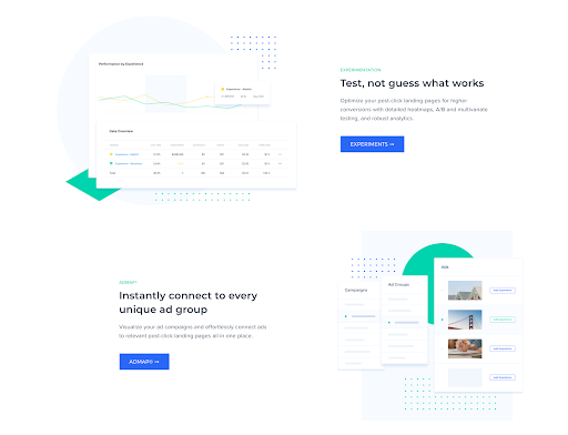
Their landing page is complemented by several screenshots of their solution in action, and the screenshots are more than just a boring screengrab. They are colorful and draw the eye in, but still allow the copy to speak for itself.
Consider Video Carefully
Even though video is hailed as the next great thing in marketing, you want to think it through carefully before committing.
It doesn’t always make sense to ask visitors to watch a video. Perhaps they are not able to play the sound, or maybe they don’t have the time to watch something and would prefer to skim some copy?
When using video, ensure it serves a clear purpose and that you have considered your audience and their preferences. Ideally, you also want to complement it with something a person can read.
Leadpages does this with an optional video on their homepage – you can choose to watch it and see their solutions in action, or you can skip it and just focus on the rest of the page.
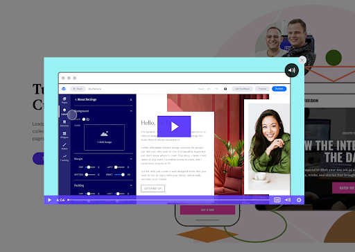
Providing the option has certainly helped some visitors convert, while others may have chosen to skip it and have been none the worse off for it.
Final Words
By carefully considering your landing page visuals, you can hope to inspire more conversions and effectively boost your bottom line. Take our advice into account, and enjoy working on your website’s appearance.
Looking for a landing page design that converts? Chat with Beanstalk today and let’s create something awesome.