
When it comes to creating websites that drive conversions, the call to action is quite literally the most important component to get right. Even the best, most conversion-optimized website can fall flat when paired with a weak call to action. Creating a compelling CTA can result in a massive improvement in conversion rates and ROI for your marketing efforts. Yet, so many websites still rely on uninspiring, stale calls to action to drive leads.
At Beanstalk, we understand that creating an engaging call to action can be intimidating. You might think that your business isn’t creative enough to pull off a bold call to action. Or maybe the classic “Submit” button is just the way you’ve always done things. We encourage creative thinking when it comes to writing calls to action because it is a move that can pay off hugely in leads and conversions.
Writing a compelling call to action doesn’t have to feel like reinventing the wheel. Take a look at the following six common calls to action. We’ll explore what makes them less-than-ideal, why you might want to consider changing up your calls to action, and some best practices for conversion-optimized calls to action.
Classic Call to Action Mistakes
1. The “Send” or “Submit” Button
Send and Submit are generic calls to action that don’t inspire anyone. If people are filling out your form, they know that they are submitting or sending their information. The only time you should be using these calls to action is to submit a test or send an email. Otherwise, you’re missing out on an opportunity to connect to the people that view your form.
A call to action should inspire action. A send or submit button doesn’t. Try swapping the send or submit button at the bottom of your contact form for something more interesting. Even if your conversion is just a simple contact form, you can frame that form in an interesting way that shows viewers the value they can expect to receive from filling out the form. Check out these contact form examples for inspiration.
2. The Single Word Call to Action
Buy. Sell. Join. Shop. Subscribe. Download. While none of these are inherently terrible, they can come across as forceful and impersonal. Single-word calls to action fall flat when they fail to highlight the benefits of your offer. Why should a potential customer buy, sell, join, etc? Furthermore, these single-word calls to action are vague enough to miss some valuable conversions despite being clear action verbs.
In most cases adding another supporting word can give the necessary context to win more conversions. CTAs with the highest conversion rates are clear, specific, and interesting.
Opt for calls to action like “Buy Now,” “Join Our Team,” “Shop Shoe Styles,” or “Subscribe Today” to give context to these types of calls to action.
3. The Learn More/Get Started Button
Again, these calls to action aren’t inherently bad – in the right context they can even be decent. But they aren’t going to inspire people who don’t already have an interest or familiarity with your product. Without the right context, these calls to action can seem ambiguous. It can be unclear what to expect by clicking buttons that say learn more or get started.
Try testing out a call to action that offers something specific to your audience. Let them know what they can expect to learn more about. In place of “Get Started” use a more specific call to action, like “Schedule My Free Consultation” or something to let a user know what the first step of “getting started” entails.
4. The Guilt Trip
Offering something like a discount, free trial, or exclusive access can be a great way to inspire people to convert. Making them feel guilty for not taking you up on your offer is annoying. We’ve all been in a situation where a CTA pops up on the screen and the only options available are a “Get 10% Off Your Order” button or a “No Thanks, I Don’t Want to Save Money” button. At best, these types of last-ditch attempts to get someone to convert are annoying; at worst, they come across as offensive.
A successful call to action allows potential customers the opportunity to convert, not the obligation. People should convert because they want what you’re offering, not just because they feel guilty. You may get more conversions with this approach, but they won’t be the most qualified. Stick with calls to action that are polite and offer something intriguing instead.
5. The Buried Call to Action
If your only call to action on a page is at the bottom of the page, most of the people who visit your website are never going to see it. Make sure to convey the importance of a call to action by including it somewhere “above the fold,” in a place where people don’t have to scroll to get to it. If there’s a sitewide call to action you’d like to encourage, include it in the header so people can reach it from anywhere on any page.
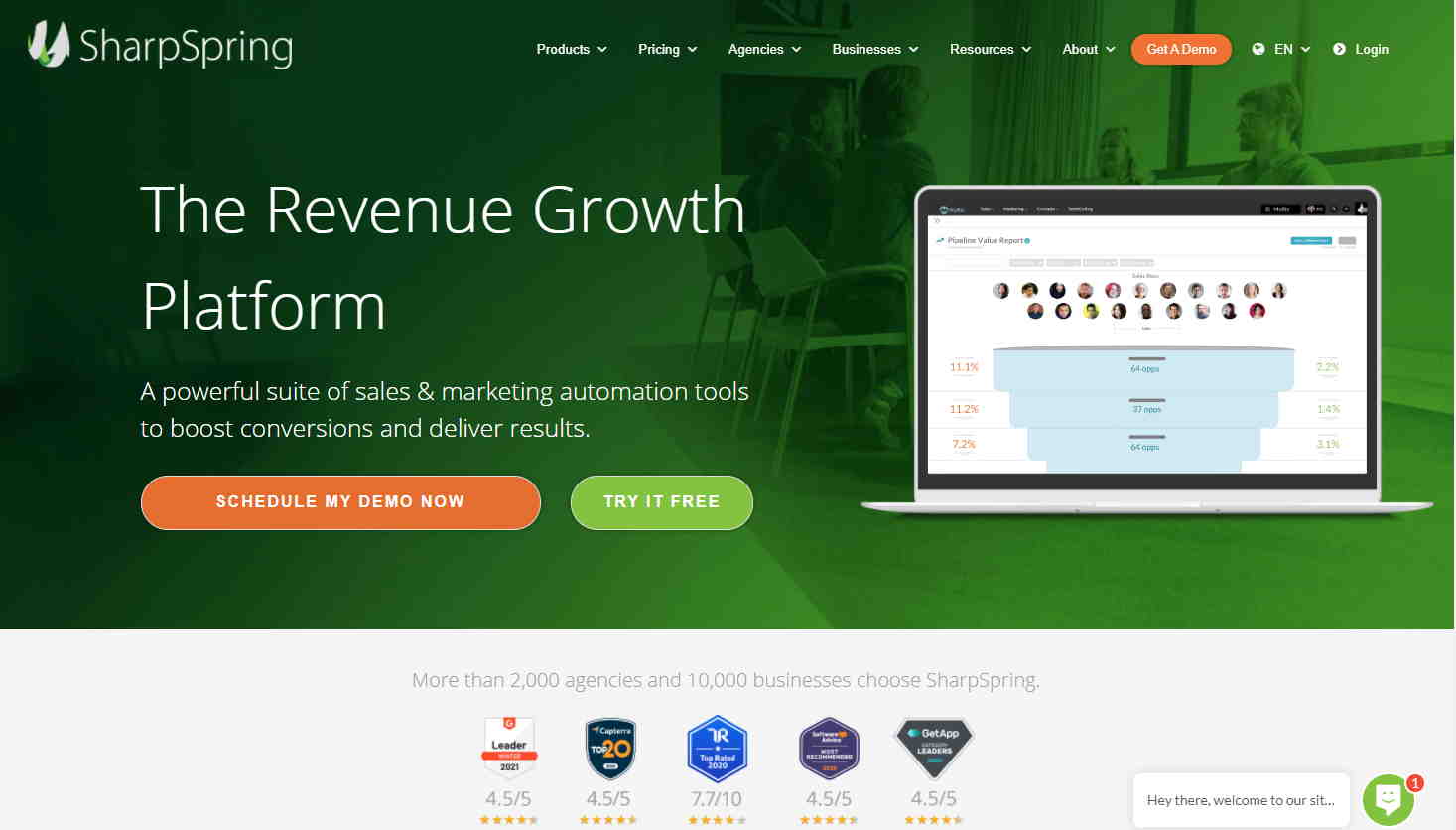
For example, our CRM partner SharpSpring makes it clear from their homepage that their main goal is to get visitors to schedule a demo. “Schedule My Demo Now” is the first thing your eye is drawn to when you reach their homepage, and the similar “Get A Demo” CTA is clearly displayed in the header menu. No matter where you go on the site, the schedule a demo button is always clear and accessible, so if you want to schedule your demo at any point, you can easily do so.
6. The Super Long Form
The best calls to action give potential customers a simple, clear, and easy way to convert. Hiding your call to action at the bottom of a lengthy form can cause potential customers to pause, get frustrated, and leave without converting. Your form shouldn’t feel like a college application.Long forms can be useful for getting super qualified, relevant leads, but they’ll also turn a significant number of people away. If you’re looking to boost your conversion rate, take a look at your form and see what fields are really necessary and where you should simplify to create a better user experience.
Some Best Practices for Writing a Call to Action that Converts
-
Make Your Call to Action Clear and Obvious
Your call to action button or form should be the loudest thing on the page. It should be what a potential customer’s eye is drawn to, and it should be clear to them that your call to action is, in fact, the action you want them to take. Use colors that contrast with the rest of your website, and make sure your call to action can’t be missed. Don’t miss out on potential conversions just because people scroll past your call to action.
-
Consider Context
Your call to action isn’t simply a button people click at the bottom of a page. The surrounding images and text influence whether or not people click it. If your call to action is a stray form or button floating at the bottom of your website, people aren’t going to feel compelled to take action. Make sure the context surrounding your call to action is all oriented toward convincing potential customers to take action.
-
Offer Customers Value
People will not convert if they feel like they have to give up something. Make it clear that your calls to action are a mutually beneficial exchange by offering an incentive for people to give up their information. Instead of making a call to action just a sign up for a newsletter, add context to show how someone will benefit. Calls to action that convey exclusivity, time sensitivity, or value often perform better than those that do not.

-
Avoid 2nd and 3rd Person CTAs
It seems obvious that calls to action should inspire action. Writing calls to action in first person can feel more dynamic and compelling than CTAs written in second or third person. Something like “Find My Local Rep” is going to catch more people than “Find Your Local Rep.” Swap “View Our Plans” for “Pick My Plan.” While it may seem a little weird or unnatural at first, first-person CTAs have been shown to have a 90% better conversion rate than those written in second or third person, so it’s worth a shot.
-
Optimize for Mobile
This one should be a no-brainer, but all of your calls to action should be optimized for mobile devices. If people have to wait until they get to a desktop computer to fill out a form, they’ll abandon it. Calls to action that work seamlessly on mobile devices lead to higher conversion rates and capture more people at the moment they are searching, no matter where they are.
-
Make CTAs Accessible, Not Overwhelming
Ever visit a website and get bombarded with popups asking you to do different things? Sign up for the newsletter and schedule a demo and download a helpful ebook and follow them on social media? It quickly becomes overwhelming, and it’s a huge turn-off for people who are looking to take a quick and simple action. Giving people more opportunities to convert isn’t necessarily better. Make sure that any calls to action you include are easy to find and obvious on your website, but don’t overwhelm visitors with too many options.
-
Plan Your Follow Up
Make sure you plan a follow-up for when people complete your call to action. If people fill out a form with contact information, be sure to contact them as soon as possible. Even if your call to action is something simple like downloading an ebook, you can schedule a follow-up email to make sure you
-
A/B Test Different Options
What works for your business and industry may not work for every business. The only way to know for sure that your call to action is performing its best is hard data. Try out a few calls to action to see which gets the highest conversion rate.
–
Writing quality calls to action can have a huge impact on the performance of your marketing campaigns. The right call to action will inspire people and get you more leads. If you are struggling with creating the perfect calls to action for your landing pages, talk to an expert at Beanstalk.