People who already know your brand or are just discovering your brand need something to remember you by; this is where your logo design plays an important role. Your logo is the symbolic representation of your business and is the very first step towards branding. Thus, you need a well-designed logo to keep your branding strong in the marketplace. However, there is never a dull moment in the design industry, as new logo design trends keep coming each year. Some trends disappear in a puff of smoke; some evolve with every passing year. To help you keep pace with the latest logo design trends for 2018, we present the most promising 7 Logo Design Trends that you can expect in 2018.
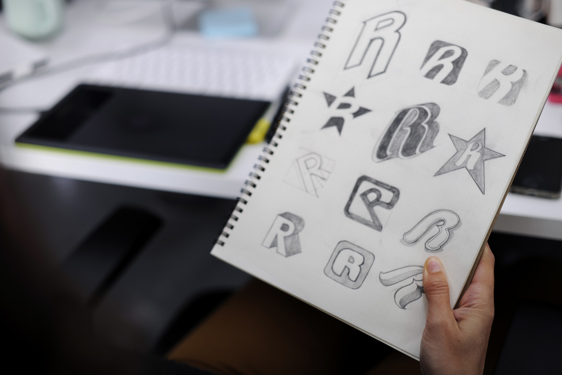
1. Creative Typography
The selection of your typography can make or break your logo, cliché but true. The typography you select needs to blend in with your brand just like the rest of the elements in your logo design. And, creative typography continues to evolve as we welcome 2018.
Let’s take a dig at this:
- Hand-effect Typography-Fancy & smooth scripts of last year are no longer enjoying the spotlight, rather it’s hand-effect fonts that are taking over. Hand-effect typography gives the impression as if it’s been handwritten. There are many options available in hand-effect, from cursive scripts to playful block letters, etc.
- Chaotic Typography- This typography is all about the placement of the letters in a chaotic, fun, and non-linear way. So, if you run a company that fits into this dynamic, casual, and playful image then this font is a good option.
- Split Typography- As the name suggests, these fonts feature some unexpected splits or negative space in the letters without interfering with the readability of the text. Logo designers get endless variations to play around with, whether that is the selection of base font or deciding placement of negative space between the letters.
So, don’t settle for any regular typography, ask your logo designer to play around with different typographies until you find one that is the best fit for your brand.
2. Flat Design
Flat design is a trend that is not only restricted to user interface but has also made an entry into the logo design world. In flat design inspired logos, you will see a shift where logos are inclined more towards the background; the use of negative space focuses attention on main branding elements, more use of color combination to convey a brand message instead of using shadows, depth, and gradient.
With flat design, you get a logo design that is cleaner, contemporary, minimalistic, and beautifully aesthetic.
3. Slices
Another logo design trend that has made entry into logo design trends is ‘Slices’. Slices are basically uses of wide parallel lines and when used to appear as ‘cuts’ in the logo. This trend is catching up a lot in the logo designs and for good reason, it adds some breathing space to the emblem and makes the design easier to absorb. Besides, slices are used to add special effects, impressions, and visual illusions in the logo and they give a textured 3D look.
 4. Say Hi to Bright Colors
Bright colors are making a comeback in 2018 and you can expect to see a lot of bright colors in the logo design. Bright colors easily grab attention and when used smartly can make your logo design memorable. Overlaying of colors is sometimes used which includes one warmth and one lighter hue along with gradient or blend effect.
Overlapping or layering of bright colors wherein you will see the use of intense colors that fade from a saturated hue to a much lighter one will be popular in the logo designs.
5. Letter Stacking gets stronger
Letter Stacking started gaining prominence in the year 2016 and will be getting stronger in 2018. Letter stacking is the best option to present lengthy phrases and names. In letter stacked logos, entire company name or letters, are placed in a column and then are spread in a chaotic way or are adjusted to the left. When created using balanced forms & color combinations, letter stacked logos look quite edgy and visually-appealing look. Be prepared to see how logo designers further explore this trend.
6. Focal letters
Another trend that is gaining popularity is the use of focal letters in the logo designs. Focal letters are widely used to dress up plain logotype. This trend is catching up and many designers are now using bare logotype for designing logos, adding one illustrated or contrasting letter in it to create a focal point in the logo design. Even a simple logo design gets a playful and fun effect by just adding a focal letter in it. Besides, it also gives personality and warmth to the logo. If you are also thinking of a logo redesign for your business you can always rely on online logo making tools like logo maker to create your logo. These online tools are easy-to-use and come with a user-friendly interface.
7. Geometric Shapes are in
Use of geometric shapes to design logos will be an uptrend enjoying dominance in 2018 as well. Geometric line logos look clean, minimalistic, and elegant. Another benefit of this geometric style is- easy readability, versatility, and instant impact. Geometric designs look extremely catchy and a thing of beauty when done well. So, you will be seeing more of this trend in 2018.

Wrap Up
Your Logo Design should reflect a unique story of your business, so it has to be timeless. You can always take inspiration from the ongoing logo trends but making a logo entirely based on these trends can make your logo dated. That’s why designers generally add simple creative twists to their existing logo design to keep it fresh and unique.