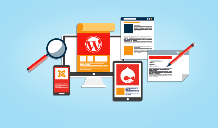
One of the most popular content management systems (CMS) today is WordPress.
It’s built using PHP, which allows web developers to easily develop a wide variety of blogs and websites.
These sites can take many forms, but they all have that one important page: the home page. Also known as a landing page, the home page introduces your website to visitors.
A good home page can boost the traffic to your site, reduce the bounce rate, and keep customers coming back again and again. WordPress makes it easy to create a customized home page for your website. There are a lot of important factors that can take a home page from just okay to great.
There are many reasons why your website’s home page should be very well designed. First of all, it’s the first page that visitors see when they land on your website. It’s a virtual front door to your website. Due to its strategic position, your homepage is responsible for either keeping visitors on your website or driving them away. Here are some tips to create an inviting, effective WordPress homepage.
Have a clean, professional, and well-designed logo
The first element of your home page is the logo. Every business should have a logo that represents it and explains to the world what the business is about. A logo expresses the identity of a business.
The image, font, and colors that are used in a logo communicate quite a lot about the business to visitors on its website. A well designed logo gives visitors a visual connection to your brand that can be easily identified wherever they go. Make sure that you use a high resolution logo as you design your homepage. Also, place the logo in a location where the visitors can easily see it.
Choose your fonts carefully
It’s important to ensure that your WordPress website looks professional. One way of doing this is to use fonts that are legible and have an attractive design. You can keep visitors on your website by making it easier for them to read your content.
As you design your website’s home page, use fonts like Georgia, Helvetica, and Arial. They are professional and highly legible. For your main points, use larger font sizes. This makes the information easy to scan. In addition to that, large typography in your WordPress website makes your content easy to read on mobile devices.
Have a layout that is clean and easy to navigate
As you design the homepage of your WordPress website, ensure that you have a balance in the usability and design of your site. Many webmasters add too many elements to their websites which can easily overwhelm and confuse the visitors. Plus, it’s distracting. Thus, you should only add elements that are completely necessary. This keeps the overall layout of your website neat and clean.
Utilize calls to action
Your homepage should always encourage the visitors to interact more with your site or your business. It should invite them to learn more about who you are. To do this, use clear calls to action (CTA) on your home page. These are words or phrases that encourage visitors to perform an action in your website that indicates their interest in your site or your business.
Examples include CTAs encourage visitors to sign up for a newsletter, request more information, or book an appointment with you. These CTAs should be placed prominently in the home page of your WordPress site. They go a long way in ensuring visitor retention.
Conclusion
WordPress is a capable and popular CMS. Many webmasters utilize it due to its advanced tools and development environment. The tips above can guide you on how to create an effective WordPress homepage.
Bio
Maria Strelling is a webmaster. She has over five years of experience in building WordPress websites. Her skillset allows her to be a reliable source of guidelines for designing an effective homepage. With her extensive knowledge on plugins and wordpress themes, which are used to develop websites, she consults in companies and helps them to create professional WordPress sites.

