The aim of any business is sales. And, what triggers these sales?
Simply, customer experience is what drives sales and takes your business to peaks of success. How does a great customer experience happen?
Have you ever thought about this? If you have thought about this in depth, by now you are aware of the one thing that drives customer experience, and it is nothing, but user experience (UX). Some businesses take help from some of the best web design and UX consultants to get their websites designed.
Only a great UX expert knows what it takes to design an aesthetic website that blends in a great UX, thus ensuring that the customers are happy with your product or service. This UX is a point that occurs when there is a flexible and non-frictional flow between the user and the product, wherein the user experiences a comfortable, intuitive and safe commutation in the user-buyer journey.
In the end, the experience is efficient, and this efficiency makes your customer happy, ensuring that your business succeeds. And, the exciting part of this is that all you get is 50 milliseconds to please your customers and ensure that they move through a great UX.
The landing page is one of the major components that decide the UX of your website. Here, is what you should be careful about when designing your landing page:
- The size of your forms matters – ensure that you keep it clean, precise and to the point.
- Insert some compelling factors, such as the CTA with attractive benefits.
- The content should be compelling and impressive, persuading the user to take the desired action.
- It is essential that you keep away all elements of distraction when designing your page.
- Once these components are blended in your site, your visitors will be happy.
Let us find out what are the secret ingredients of the UX that you should be implementing on your landing pages to ensure a great UX.
- Navigation or scrolling – which is better?
Here are specific findings that suggest why scrolling is way better than navigation:
- For pages that have the scrolling option, 22% of people scrolled through the page toward the bottom
- 91% of views happen on pages that come with a scrollbar
- And, 76% of 91% comprised of scrolling action.
This brings us to the point that even if we keep our elements equally distributed above or below the page fold, scrolling will ensure that people crawl across.
But, of course, a compelling story, along with the other landing page elements are needed to drive visitor attention, ensuring that they enjoy all the benefits offered by you and finally perform the action that was expected of them on the CTA.
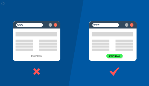
- The role of CTA buttons
Once you persuade them to the CTA button, you are close to converting your people into loyal customers. So, when designing your CTA buttons, you need to be very careful. This can be achieved by implementing contrasting colors, curating personalized messages that will drive them to take the desired action.
It is considered that the color contrast of CTA buttons is one of the best landing page practices, which automatically drives conversions. This is where a sticky CTA button comes into the bigger picture, and here it takes up the role of following the users or your visitors as they scroll through. Since it follows them; it is always etched in their brain. Ultimately, at any point in time, whenever they want to make a purchase decision, this could generate the urge to take the desired action and convert into your most loyal customer.
It is not necessary that you introduce some massive ideas, simple and easy ideas for CTA buttons easily resonate with the people, and they convert.
- Videos: do they drive people?
Explainer videos are often referred to as the videos that generate sales. And, by now we are quite familiar as to how the magic of these explainer videos converts a visitor into a customer. The explainer video implements animations to market promotions. Apart, from the explainer video, there is persuader video that utilizes the power of humans to prove the vision of your business. As well as to provide further insights into the functionality and features of your products, while also including customer testimonials regarding the product characteristics that helped them through.
Moreover, persuader videos are capable of generating a human connection or personalizing with the visitors. Always, a real person’s words can create a high impact compared with any other means of marketing or promotion.
- Role of anchor tags
Have you heard of the power of visual cues? Yes, most of us have experienced the magical ability of visual cues in directing a visitor in a specific direction to their destination across the landing page. Visual cues come in various forms, such as human line of sight or arrows, and all of this point toward the CTA button, which is where your visitor has to reach to take the desired action. The directions from the visual cues persuade the visitors to scroll down toward the bottom of the page. You can include anchor tags toward the bottom of the page to ensure that people scroll through to the last point.
Anchor tag provides you with the facility to position the links on your landing page, from where the users can easily commute from one point on this page to any other, as they wish. Navigation between the different sections of the page is made easier ensuring a great user experience.
- White space: is it necessary or not?
When we talk about white spaces, some say that it is for good so that we do not strain our people a lot while they scroll through our pages. But, some are of the opinion that white space can be avoided since these are negative spaces. The spaces that are left unmarked or are empty for no reason can be grouped under white space. All spaces that are present between various web page elements, including paragraphs, images, text, etc. comprise the white space.
But, the truth is the presence of white space provides better clarity and enhances the readability of the elements on your page, thus attracting your visitors to this point.
A well-designed landing page is the crux of your conversion process, as it will determine how long a visitor will stay on your site. Also, this is one of the points that will drive user experience and ensure that they take a favorable decision, which ultimately leads to success.
All this ensures that you are generating brand value for your business, which will enhance your reputation in the long run.
Author Bio:
Rajeesh is a Director and Creative Head at Acodez. He helps the company to meet its clients’ needs to craft a compelling online presence. His 10+ years experience and expertise in UX, UI, Information Architecture and Wireframing help the company to develop user-friendly, pleasing and aesthetically appealing websites. He regularly researches and writes about the latest trends in web designing and development.

