Have you ever thought what makes some mobile websites successful and some a failure? The main difference lies in their user-interface which either makes a visitor stay or turn away from your site. If you are planning to build a mobile website for your business then this blog is for you.
Read on to know 5 tips that will help you design a perfect UI for your Mobile Website and will help you deliver best possible mobile experience to users.
- Finger-Friendly Design
Have you ever come across a site while browsing through your mobile device wherein you were asked to press a button but it was so tiny that you accidentally pressed the wrong button? Or have you ever had a hard time reading a content that you had to zoom in to a great extent to read something? Sound familiar? Well, that’s why when designing a mobile website, size matters a lot. And when I emphasize size, it is not only about the size of the page rather considering size of fonts and buttons as well.
Fonts- Ideal font size for a mobile website is 14px, though on the first thought you may find it big but for mobile devices it is appropriate. It makes the content readable for viewers and they can read it easily without any need for zooming in.
Buttons-When it comes to buttons, just stick to the acronym BBAB (Bigger Buttons Are Better). Even mobile giants like Apple recommend that button size needs to be minimum 44px by 44px to ensure better user experience and increased conversions on your site. So, make sure buttons are big enough so that users don’t end up mistakenly pressing the wrong one.
Thus, for UI of a mobile website, you need to follow said guidelines for fonts and buttons.
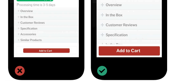
Image Source: Hootsuite
- Include a viewport meta tag
When building a mobile website, including a viewport meta tag is a must. It allows the browser to define a virtual area that determines how the content of the web design needs to be scaled and sized. Without this, your site will not operate seamlessly on a mobile device.
Thus, including this viewport meta tag is critical as it commands the mobile browser to ensure it fits the smaller screen and delivers an optimal experience to the users. Remember, to specify the chosen configuration that you want your viewport to control, at the head of the document.
- Don’t include Long Forms
Filling up long forms turns users away even on desktops and as far as UX of a mobile website is concerned, the task becomes even more painful when browsing via mobile devices. Form-filling on smartphones takes more time than on desktops and often encourages users to switch to some other site. So, avoid including long forms on your mobile website or keep it as minimal as possible.
And in case you need to add forms then make sure you keep them short, simple, and clean. Autofill forms and auto-suggest entries also make a great option. Besides, make accessing inbuilt tools like camera, address book, and number pad easy this will help you take some pain out of form-filling from a mobile device. Despite this, if you find the user leaving the form in the mid-way then you always have the option to mail link of the same form to the user. This gives users lot of comfort as they can fill out the rest of the fields later from their desktop and increases your chances of conversions as well.
- 4. Identify your users
When designing a mobile website you need to know who your users are. For this, you need to do a thorough research for who your audience is. Knowing your users will help you in understanding user intent and user behavior. Contemporary internet users can be divided into two major types: ones who are exploring your site without any definite goal in mind or the ones who have the intent to perform a task. Both types of users will prefer different functions based on their needs. Thus, the needs of your users dictate the design of your mobile website.
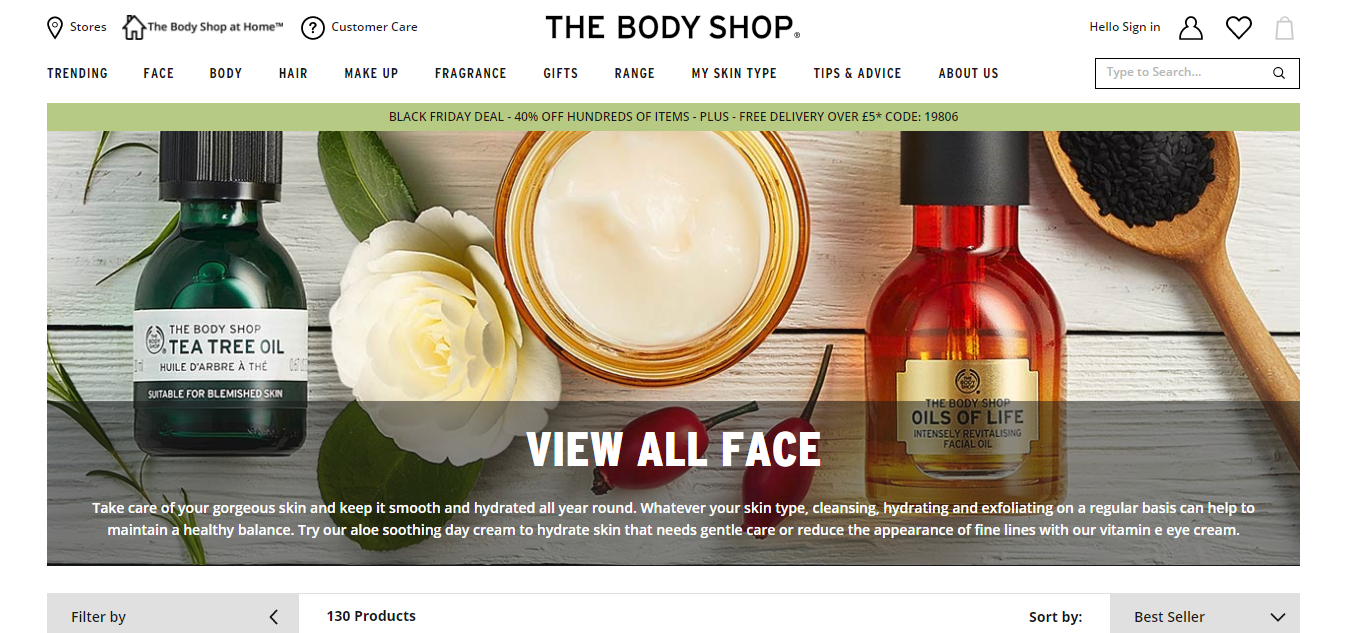
For Example– Body Shop products endorse natural and Eco-friendly ingredients and for this reason, their website designs also have monochromatic green variations, images have green color primarily, and the green color of header template, thus their website follows a well-defined design concept.
If your site caters to the unique needs of the user then users will be able to navigate through your site without any interruption and will be able to take quick decisions without wasting any time.
- Create Fluid layouts
As you know, there is an overwhelming option of screen sizes available and among that; it will be a tough call to pick which ones you want to design for. For this, you need to create fluid layouts for your mobile website as they seamlessly adapt to different screen sizes.
The advantage with the fluid layout is, they don’t work based on pixels wherein you need definite measurements rather they go by percentage widths. Fluid layouts are also known as liquid layout adjust to the screen of the users’ and makes sure that the mobile users get an optimal experience.
Lastly, for best results when you are designing a mobile website, keep your user in the center of the designing process. With this objective, you would be able to design a website that gives mobile users a delightful experience.
Author Bio: Campbelljof is a Creative Head for Designhill, as well as a blogger and designer. He writes on topics concerning design, eCommerce, start-ups, digital marketing, and interactive content. His creative work has earned him several laurels over the years.