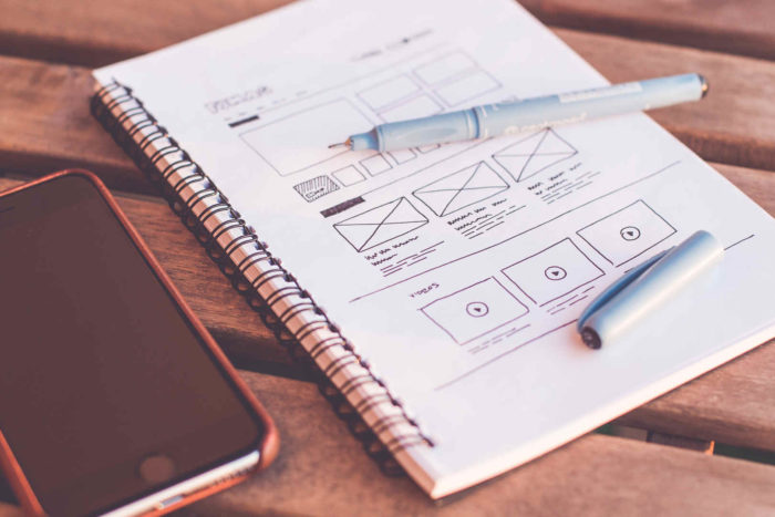
As most people may already know, web design elements play a big role in attracting online subscribers.
With a single look, what would make your visitors say makes your website worth their time?
Answer: Visual impact. Graphics — the sudden burst of colors and eye-catching arrangement of web design elements — can actually leave a longer and stronger impression than a page’s actual cause that is presented in verbose articles.
Most netizens continuously scroll through millions of pages online. And usually, they will stop at a page that has impressed them visually.
Having good web design elements is like giving your visitors the fastest assurance that what they’re looking for is within your page. It is like a preview of how professional the service you can give is.
In order to provide that single-glance assurance, you need to include these 4 critical web design elements to make your website a successful one.
1. A logo that shows it all.
Your website’s logo will be its ultimate trademark across the whole digital universe. It is not only important that it looks presentable; it should also portray — in a clear and cool way — what your site has to offer.
Harmonizing the logo’s design with the site’s theme is also important to hook the people within the age range of your target market. You can decide if you would rather make a trendy, cool, kid-friendly logo or an all-professional type of logo.
For beginners, making sure that your design will be a remarkable one could be confusing. Begin by creating a simple yet striking logo. Choose a single color at first and then try working it out with various shapes. Ask for others people’s opinions about your work, and then show it off to the Internet by hitting the upload button.
2. Toned typefaces
The typography used on web pages covey just as much as the messages it creates. This is the single-look cue of subscribers to know if a website is a trendy blog or a pitch-black professional page.
The use of typefaces according to the vibe you want your web visitors to feel is important and is a big help in expressing a site’s cause. As much as it helps heighten the contents of a page’s texts, the right typeface also encourages your online visitors to read through your message.
What more could help in growing a number of followers than have them understand your goals and encourage them to be with you?
3. Power pictures
No matter what type of website you are designing, pictures should be included in your layout. Not only do pictures make your page appear refreshing in your followers’ eyes, they also help readers understand the messages of your text easily.
In web design, including pictures that would dynamically play along your chosen palette could be hard, but it is something that can be easily fixed with a little photo editing. All you really need is for the picture not to be completely out of place, so minimal edits can be enough.
Choosing a good photo is also as important as deciding what content to put in your page, as uploading a blurred, pixelized, or low quality image can easily turn off your potential subscribers.
If you are in great need of awesome pictures, you can actually use photos found online, so long as you put proper photo credits and copyright on your page. The Internet is full of royalty-free photos, so do your research well.
4. A balanced layout
The format of a web page, again, solely depends on the creativity and the ideas of the web designer. However, it is a must-know that most popular homepages leave their displayed page uncrowded.
It is important that a webpage does not become overcrowded with unnecessary stuff, especially if a page is dedicated to sharing information to its followers.
As a web designer, your goal should not only be making the website look good, but also creating it in an organized manner.
Give your audience’s eyes time to relax. And provide them with short texts, so they will be encouraged to read. Long text and huge word chunks will bore them easily, so make sure that your texts are short yet succinct.
Arrange the page with just enough content and make sure to lay out the articles according to how you like your visitors’ sight to be moving around the page.
There are hundreds of other web design elements to consider in creating a page that will be a hit with your visitors. But the elements mentioned are all the things you will need to include if you want to boost your site into a digital success.
For all of your website needs contact Beanstalk Web Solutions.
Author Bio:
Rajesh Sawant is passionate about his art and when not sharing his knowledge about Website Maintenance, website designing and graphics he can be found hunched over his computer, creating breathtaking visuals. He is an alumnus of Anibrain school of Media Design. Currently, he is working as a Graphic designer with Miracleworx Web Design India.


